Form controls break in a handful of repeatable ways. A global input { width: 100% } stretches checkboxes across the row. A native <select> draws its arrow near the border and ignores padding-right. An absolutely positioned icon sits on top of the text because the input has no padding for it. A fixed height plus padding squashes the text. And controls in a row end up different heights. All five are CSS interactions that look fine in code and wrong on screen.
- Scope full-width input styles to text fields, not to every
input. - Style the select arrow yourself with
appearance: none. - Give an input padding on the side where an icon sits.
- Use either
heightwithpadding-block: 0, or padding withheight: auto. - Give controls in one row the same height, or let the row stretch them.
Why is my checkbox stretched across the whole form?
Because a reset like this applies to checkboxes too:
input { width: 100%; }A checkbox is an input. With width: 100% its box is stretched to the container's width, and the tick is drawn in the middle of that space, far from its label. Radio buttons do the same. Often the label then wraps onto its own row.
Fix it in two places: scope the rule to text-like fields, and lay the box and label out as a row.
input:not([type=checkbox]):not([type=radio]) { width: 100%; }

.check { display: flex; align-items: center; gap: 8px; }
.check input { width: 18px; height: 18px; flex-shrink: 0; margin: 0; }
Use align-items: flex-start for labels that wrap onto several lines. In Tailwind: w-4 h-4 shrink-0 on the box.
Why does the select arrow ignore my padding?
Chrome and Safari draw the native arrow of a <select> close to the border, and padding-right doesn't move it. So a select with padding: 0 22px has its text starting 27px from the left and its arrow jammed against the right edge. The mismatch looks careless even though each value in the CSS is reasonable.
Draw the arrow yourself and put it inside the padding:
select.field {
  appearance: none;
  padding-right: 44px;
  background: #fff url("chevron.svg") no-repeat right 18px center;
}
Keep the arrow's right inset close to the text's left inset. The example page uses a 22px left padding for text and an 18px right offset for the chevron. The same applies to custom triggers and background-image chevrons: the point is that the two insets look equal, not which technique draws the arrow.
Why does my search icon overlap the text?
The usual pattern is a wrapper with position: relative and an SVG with position: absolute; left: 14px. Absolute elements don't take space, so the input's text starts at the input's normal left padding and runs under the icon. Typed text and the placeholder collide with it.
.search { position: relative; }
.search svg { position: absolute; left: 14px; top: 15px; width: 16px; height: 16px; }
.search input { padding-left: 40px; }  /* 14px + 16px icon + 10px gap */
For a trailing icon use padding-right. Tailwind: pl-10 for a 16px icon at left: 12px, pr-10 for a trailing one.
Why is my input too short for its text?
A fixed height plus vertical padding leaves the text a content box that is too small. A <select> keeps its padding, so a 32px select with 12px of padding top and bottom has only a few pixels left for 16px text. An <input> with height: 16px and 16px text has almost none. The glyphs are cut at the top and bottom or squeezed against the border.
Pick one approach:
/* A: fixed height, no vertical padding */
.field { height: 44px; padding-block: 0; }

/* B: padding decides the height */
.field { height: auto; padding-block: 10px; }
As a rule of thumb, a 16px font needs about 20px of content height (this is the squashed-control rule's own guidance).
Why are the input and the button next to it different heights?
An input has height: 40px; the button next to it has height: 48px. Neither looks wrong alone, but side by side their edges don't line up. It also happens when a <select> sits next to a text field styled by a different class. Give both the same height, or let the row stretch them:
.row { display: flex; gap: 8px; align-items: stretch; }Or set one shared token, for example h-10 on both in Tailwind.
How do you spot these bugs?
| Symptom | Likely cause | Fix |
|---|---|---|
| Checkbox in the middle of a wide row | input { width: 100% } |
:not([type=checkbox]) scope, width: auto, flex row |
| Arrow touching the right border | Native select arrow ignores padding-right |
appearance: none plus your own chevron |
| Text under a search icon | Absolute icon, no padding | padding-left past the icon |
| Text cut off in a field | Fixed height plus vertical padding |
height with padding-block: 0, or height: auto |
| Input and button edges don't line up | Different heights | Same height or align-items: stretch |
The reliable way is to look at pixels. Computed styles lie here: the arrow of a native select isn't in the DOM, and an icon's overlap depends on where the text actually starts. Open the page, look at the control, and measure.
How renderlint catches it
Five rules cover these bugs. The first four are errors and the last is a warning (rule reference):
| Rule | Default | What it reports |
|---|---|---|
dropdown-arrow |
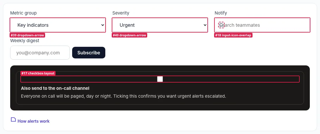
error | The arrow is much closer to the border than the text is to the other side. Measured from pixels, so it covers native arrows, background-image chevrons and custom triggers. |
checkbox-layout |
error | A checkbox or radio stretched to full width, or on its own row above its label. |
input-icon-overlap |
error | An icon drawn over the area where the field shows text and placeholder. |
squashed-control |
error | Height minus vertical padding leaves less room than the font needs. |
control-height-mismatch |
warn | Controls side by side with different heights. |
This is the real output for the example form (a 46px field with 22px padding, an unscoped input { width: 100% }, and a search icon at left: 14px), checked at 375, 768 and 1280px:
✖ checkbox-layout (1)  A checkbox or radio button is stretched to the full width (drawn in the middle, away from its label), or sits on its own row above its label.
  error A checkbox is stretched to 289px wide, so the box is drawn in the middle of that space, away from its label (usually a global `input { width: 100% }`).
        at #e
        page /forms-before.html · all viewports · see .renderlint/screens/forms-before-html-vwbhz@375.png #1

✖ dropdown-arrow (1)  A dropdown's arrow sits much closer to the border than its text does to the other side, so it looks jammed against the edge. Measured from pixels, so it covers native arrows, background-image chevrons and custom triggers.
  error The dropdown arrow sits 3px from the right border while the text starts 27px from the left, so the arrow looks jammed against the edge. The browser draws the native arrow near the border regardless of padding-right.
        at #f  "Every hour Daily digest"
        page /forms-before.html · all viewports · see .renderlint/screens/forms-before-html-vwbhz@375.png #3

✖ input-icon-overlap (1)  An icon (search, mail, calendar) is drawn over the part of an input where its text and placeholder appear, so typed text runs underneath it.
  error An icon is drawn over the area where the field shows its text and placeholder (16px of overlap on the left). Typed text will run underneath it.
        at #q
      with main > form.card > div > svg
        page /forms-before.html · all viewports · see .renderlint/screens/forms-before-html-vwbhz@375.png #2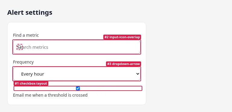
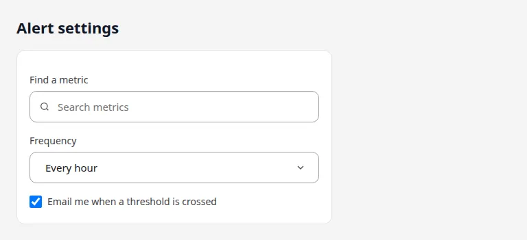
The fixed page printed ✔ No UI defects found.
squashed-control and control-height-mismatch have their own fixtures. On test/fixtures/defects/squashed-control.html (a 32px select with 12px padding and a 16px-tall input, both with 16px text) renderlint reports:
✖ squashed-control (2)  An input or select is too short for its text: height minus vertical padding leaves less room than the font needs, so the text is cut off at the top and bottom.
  error The field is too short for its text: 6px of room inside the padding for 16px text, so the text is cut off at the top and bottom.
        at #r  "Engineering manager"
        …
  error The field is too short for its text: 14px of room inside the border for 16px text, so the text is squeezed against the border.
        at #t
        …
On test/fixtures/defects/form-warnings.html, a 40px input beside a 48px button, renderlint reports this among other findings:
⚠ control-height-mismatch (1)  Controls placed side by side (an input and its button, a select next to a text field) have different heights, so their edges don't line up.
  warn  Controls side by side have different heights (40px and 48px), so their edges don't line up.
        at form.row > input
      with form.row > button  "Subscribe"
        …
Findings are tuned to avoid false positives. If one is intentional, mark the element with data-renderlint-ignore="<rule>" and a data-renderlint-reason.
Frequently asked questions
Do these bugs only show at some screen widths?
Some do. renderlint checks each page at three viewports (375, 768 and 1280px by default) and, with the sweep, at more widths. A stretched checkbox is visible at all three in the example, but a row of controls that wraps can only break at one width.
Can I keep the native select arrow?
You can, but Chrome and Safari draw it near the border regardless of padding-right. The fix is appearance: none with your own chevron, or an icon positioned inside the padding.
Why not use a visual regression tool for this?
A baseline tool will show these bugs as diffs only if a design was approved without them. The first screenshot of a broken form becomes the baseline.