Text overflow happens when a line of text is wider than the box that is meant to hold it. The text either spills past the edge (overflow) or gets cut off by an overflow: hidden ancestor (clipping). The cause is almost always a rule that stops the text from wrapping or shrinking: a fixed width, white-space: nowrap, or a flex item that can't get smaller than its content. To find it reliably you have to look at more than the three screen sizes and the sample data you built the page with.
- Fixed
width,heightandwhite-space: nowrapon text containers are the usual cause. - Flex and grid items default to
min-width: auto, so a long unbreakable string stops them from shrinking. overflow: hiddenturns a visible spill into silent clipping, which is harder to notice.- A layout can fit at 375, 768 and 1280px and still break at 1024px, or the moment a real customer has a long name.
Why does text overflow its container?
A browser lays out text in lines. It can break a line at a space or a hyphen, and nowhere else. When the available width is smaller than the longest piece of text that can't be broken, one of three things happens:
- The box grows to fit (if its width is
autoand nothing limits it). - The text sticks out of the box (the default for a box with a fixed or constrained width).
- The text is cut off (if the box, or an ancestor, has
overflow: hiddenorclip; withautoorscrollyou get a scrollbar instead).
Case 2 is text-overflow in renderlint terms. Case 3 is text-clipped. A third, quieter state is a string that still fits but has run through the card's padding and nearly touches the border. renderlint calls that text-crowding.
Which CSS properties cause it most often?
| CSS | What it does | Why it breaks | Safer version |
|---|---|---|---|
white-space: nowrap |
Forbids line breaks | Text can't wrap, so it is as wide as it is | Remove it, or pair it with text-overflow: ellipsis if truncating is intended |
width: 300px on a card |
Fixes the box width | Wider content spills out | max-width: 300px, or a fluid width |
height: 40px with line-height: 40px on a button |
Fixes the box height | Wrapped text escapes the box | min-height, and padding instead of line-height |
Flex or grid item with default min-width: auto |
The item won't shrink below its longest word | A long email or ID stretches the column | min-width: 0 on the item |
overflow: hidden |
Clips anything outside the box | Hides the problem instead of showing it | Let the text wrap, or truncate on purpose |
Large fixed font-size on numbers |
Big text in a narrow column | A seven-digit price doesn't fit a three-column grid at 1024px | clamp() with a container query unit |
Why do flex and grid items refuse to shrink?
A flex item's minimum width is its content's minimum size, not zero. For text, that is the longest word or unbreakable string. So flex: 1 on a column with dana.whitfield-procurement@northwind-enterprise.example.com inside it can't go below the width of that address. The fix is to say the item may shrink:
.card { min-width: 0; }            /* flex or grid child may shrink below its content */
.card p { overflow-wrap: anywhere; } /* and long strings may break anywhere */
overflow-wrap: anywhere also lowers the item's min-content size, so it works for layout, not just for painting. overflow-wrap: break-word does not change the min-content size, which is why anywhere is the better default in flex and grid children.
Why does it only break at 1024px, or with real data?
Most developers check the layout at a phone width and a desktop width, with whatever sample text was handy. Two things hide overflow from that approach.
Widths in between. A grid that has four columns above 1024px and two below can be squeezed hardest right at the breakpoint, where each column is as narrow as it will ever be while still being a four-column layout. At 1280px the cards are wide. At 768px there are fewer columns. At 1024px, a value like $4,939.27 no longer fits.
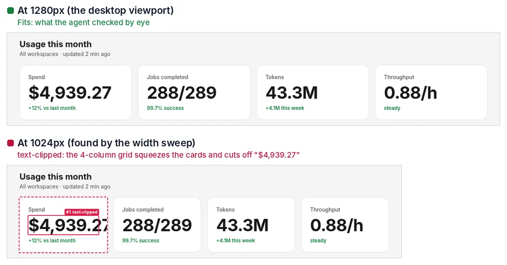
Content you didn't have. Sample data is short. Production data has a company called "Internationale Versicherungsgesellschaft", a long procurement email address, a revenue number with three more digits than the mock, or a translation that is 50% longer than the English. None of that exists in the development database.
How do you test for it by hand?
You can do a decent job without any tool if you are systematic.
Sweep the widths
Drag the browser's responsive mode from 320px to 1920px slowly. Stop at each breakpoint in your CSS and check both sides of it: if the breakpoint is max-width: 900px, look at 900 and 901. The failures cluster just above a breakpoint, where a multi-column layout is at its narrowest.
Stress the content
Change the content in dev tools and see what breaks:
// Paste in the console: make every text node 50% longer
const walker = document.createTreeWalker(document.body, NodeFilter.SHOW_TEXT);
for (let n; (n = walker.nextNode()); ) {
  const t = n.textContent.trim();
  if (t.length > 3) n.textContent = t + ' ' + t.slice(0, Math.ceil(t.length / 2));
}
Then try these cases one at a time:
| Stress | Example | What it exposes |
|---|---|---|
| Longer text | A button label 50% longer | Fixed-width buttons, fixed-height cards |
| Long unbreakable word | A 40-character email, URL or ID | Missing min-width: 0 and overflow-wrap |
| Bigger numbers | $1,284,930.55 instead of $4,939.27 |
KPI tiles and table cells with nowrap |
| Long names from the API | A full legal company name | Headings in fixed-height cards |
This is slow, and nobody repeats it after the next refactor.
What does a real defect look like?
The example below is a small billing page. It has three KPI cards, an account card with a long email address, and a button. It was run through renderlint at 375, 768 and 1280px with the width sweep and stress passes on.
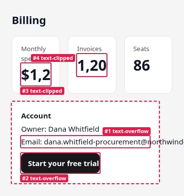
The CSS behind it is the usual suspects:
.kpi .v { font-size: 30px; font-weight: 700; white-space: nowrap; overflow: hidden; }
.acct   { width: 300px; }
.acct p { white-space: nowrap; }
.btn    { display: inline-block; width: 160px; height: 40px; line-height: 40px; white-space: nowrap; }
And this is the report, copied exactly from the run:
✖ text-clipped (1)  Text is partially cut off by an `overflow: hidden` container or the edge of an <svg> (e.g. chart axis labels).
  error Text is cut off by an overflow:hidden container (137px past the right edge). (×2 similar elements)
        at main > div.grid:nth-of-type(1) > div.card.kpi:nth-of-type(1) > div.v:nth-of-type(2)  "$1,284,930.55"
        page /overflow-before.html · all viewports · see .renderlint/screens/overflow-before-html-1ddxy@375.png #3

✖ text-overflow (2)  Text spills outside the box (card, button, badge, input) that is supposed to contain it.
  error Text spills outside its container (227px past the right edge).
        at main > div.card.acct:nth-of-type(2) > p:nth-of-type(2)  "Email: dana.whitfield-procurement@northwind-enterprise.example.com"
      with main > div.card.acct:nth-of-type(2)  "Account Owner: Dana Whitfield Email: dana.whitfiel"
        page /overflow-before.html · all viewports · see .renderlint/screens/overflow-before-html-1ddxy@375.png #1
  error Text spills outside its box (46px past the right edge).
        at main > div.card.acct:nth-of-type(2) > p:nth-of-type(3) > span.btn  "Start your free trial today"
        page /overflow-before.html · all viewports · see .renderlint/screens/overflow-before-html-1ddxy@375.png #2

✖ viewport-overflow (1)  Content is wider than the viewport: the page scrolls sideways on phones, or content is cut off at the screen edge.
  error Element extends 4px beyond the 320px viewport, causing horizontal page scroll.
        at main > div.card.acct:nth-of-type(2)  "Account Owner: Dana Whitfield Email: dana.whitfield-procurement@north…"
        page /overflow-before.html · at 320px · see .renderlint/screens/overflow-before-html-1ddxy@320.png #5

⚠ fragile-layout (1)  Stress test: the layout breaks with content the sample data doesn't have yet: ~50% longer text, long unbreakable emails/URLs/IDs, numbers with three more digits, longer API data, or the worst case declared with data-renderlint-maxlength / data-renderlint-sample (that last one is an error).
  warn  With bigger numbers (three more digits): Text is cut off by an overflow:hidden container (34px past the right edge).
        at main > div.grid:nth-of-type(1) > div.card.kpi:nth-of-type(3) > div.v:nth-of-type(2)  "86,000"
        page /overflow-before.html · at 375px

✖ 5 error(s), 1 warning(s) · screenshots in .renderlint/screens
Two things in that output are worth reading closely. The email overflow is reported at all widths in the sweep, because the card is a fixed 300px wide. The viewport-overflow finding only happens at 320px, where the card is 4px wider than the screen. And the fragile-layout warning is about the third KPI card, which looks fine today: the value is 86, but with three more digits it is clipped. That is a defect the sample data hides.
How do you fix text overflow?
Give the text a way to wrap, and give the boxes a way to shrink. The fixed version of the page above:
.grid   { display: grid; grid-template-columns: repeat(auto-fit, minmax(220px, 1fr)); gap: 16px; }
.kpi    { container-type: inline-size; min-width: 0; }
.kpi .v { font-size: clamp(1.25rem, 10cqi, 1.875rem); font-weight: 700; overflow-wrap: anywhere; }
.acct   { max-width: 300px; }
.acct p { overflow-wrap: anywhere; }
.btn    { display: inline-block; padding: 10px 14px; }
What changed and why:
auto-fitwithminmax(220px, 1fr)replaces a fixed three-column grid. The number of columns follows the available width, so there is no width at which the cards are squeezed to nothing.clamp()withcqisizes the number relative to its card (container-type: inline-sizemakes the card a query container), so a longer number gets a smaller font instead of being cut.overflow-wrap: anywherelets the email break inside the card.max-widthinstead ofwidth, and padding instead of a fixed height and line-height on the button, so a longer label wraps and the button grows.
Re-running renderlint on the fixed page gives the whole report:
renderlint — 1 page(s) × viewports 375px, 768px, 1280px
✔ No UI defects found.
When is clipping on purpose?
Sometimes you do want to cut text: a table cell, a card title in a dense list. Do it explicitly with text-overflow: ellipsis or line-clamp, so the cut is visible as a design choice. A single line looks like this:
.cell { white-space: nowrap; overflow: hidden; text-overflow: ellipsis; max-width: 24ch; }How renderlint catches it
renderlint renders each page in headless Chromium at phone, tablet and desktop widths, then measures geometry inside the page: the rectangle of every run of text against its containers and clip boxes. Text outside its box is text-overflow; text cut by an overflow: hidden box or the edge of an SVG is text-clipped; text that fits but runs through the padding is text-crowding; a page that scrolls sideways is viewport-overflow. All of these are errors by default. See the rules reference for each rule's guidance.
The part that finds the "only at 1024px" and "only with real data" cases is the stress step. It runs these checks:
| Check | What renderlint does |
|---|---|
| Width sweep | Re-runs the layout rules at 13 widths from 320 to 1920px and on both sides of every breakpoint the page uses |
| Longer text | Lengthens every text by 50% |
| Long words | Turns emails, URLs, domains and IDs into 36+ character strings with no break points |
| Big numbers | Gives KPIs, prices and counters three more digits |
| Longer API data | If the page fetched JSON, reloads it with longer names, titles and emails in every response |
| Declared worst cases | data-renderlint-maxlength="60" or data-renderlint-sample="…" on an element tests exactly that content; failures are errors |
Anything that only breaks under stress becomes a fragile-layout warning. When a field has a known limit, declare it: <h3 data-renderlint-maxlength="60">{project.name}</h3>. The attribute does nothing in production.
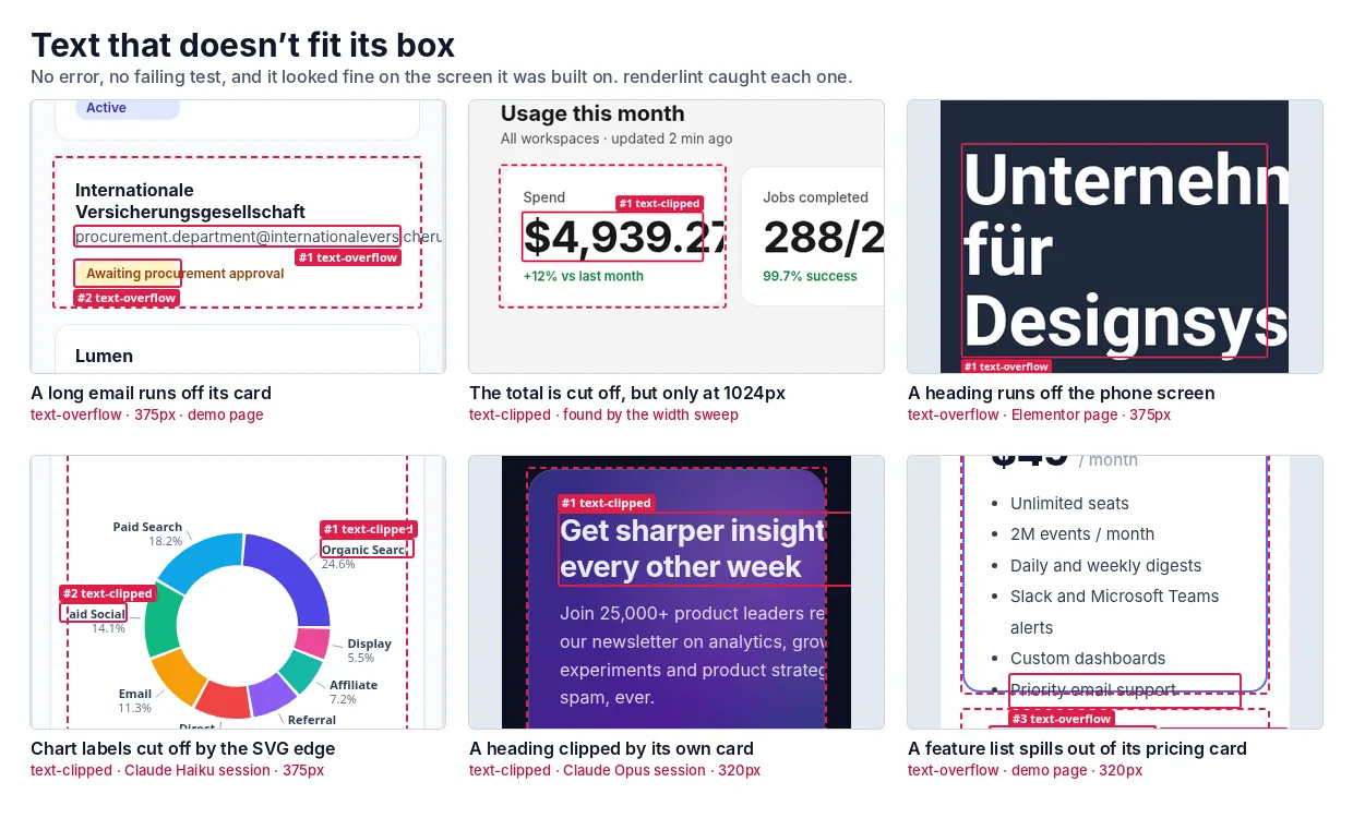
Things renderlint leaves alone on purpose, because they are usually intentional: text-overflow: ellipsis, line-clamp, scroll areas, screen-reader-only text. The documented limitations include:
<canvas>charts are pixels, so their labels can't be inspected. Use an SVG renderer for charts you want checked.- Content behind clicks (dialogs, tabs, filled forms) is only linted when you list it in
statesor reach it in a Playwright test. - A single page takes about 4 to 10 seconds at three viewports with the sweep and stress passes.
--sweep 1024or--no-sweepgives a faster inner loop.
Frequently asked questions
Is overflow: hidden ever the right fix for overflowing text?
Only when cutting the text is the design. Then use text-overflow: ellipsis or line-clamp so the cut is deliberate. As a way to make an overflow warning go away, it replaces a visible bug with a hidden one.
What is the difference between overflow-wrap: anywhere and word-break: break-all?
overflow-wrap: anywhere breaks a word only when it would not fit on a line, and it also reduces the item's minimum content size in flex and grid. word-break: break-all breaks every word at any character, even when it would have fit, which makes normal text ugly.
Should I fix a fragile-layout warning if the page looks fine?
It means the page broke under content it doesn't have yet, such as a longer name or a bigger number. If that content is realistic, fix it. If it is not, say so with data-renderlint-maxlength and fix the limit instead.