To measure contrast on a gradient or a background image, you have to measure the pixels behind the text, not the CSS. WCAG 2 compares the text color with the background color, and a gradient or photo has many background colors. Tools that read only the DOM and computed styles can't know which one sits behind each letter, so they report "needs review". The reliable method is to render the page, remove the text, and read the real background pixels where each glyph was.
- WCAG 2 AA needs 4.5:1 for normal text and 3:1 for large text.
- White text on a light-to-mid blue gradient fails in the light half, even if the dark end passes.
- A
text-shadowis not a fix: the formula compares the text color and the background, and a shadow is neither. - The fix is a darker background, a darker set of gradient stops, or a scrim between the image and the text.
What contrast ratio does WCAG require?
WCAG 2 defines contrast as a ratio between the relative luminance of two colors, from 1:1 (identical) to 21:1 (black on white). The formula is:
ratio = (L1 + 0.05) / (L2 + 0.05)     L1 = the lighter color's luminance, L2 = the darker one's
L = 0.2126 R + 0.7152 G + 0.0722 B     R, G, B linearised from the sRGB values
The thresholds come from success criteria 1.4.3 (AA) and 1.4.6 (AAA):
| Text | AA (the usual target) | AAA |
|---|---|---|
| Normal text | 4.5:1 | 7:1 |
| Large text: 24px and up, or 18.66px and up in bold | 3:1 | 4.5:1 |
renderlint checks AA by default, and AAA when you set "contrastLevel": "AAA" in its config. Large text gets its lower threshold from the size and weight, which is why the same gradient can fail a caption and pass a headline.
Why do axe and Lighthouse say "needs review" on gradients?
Those tools read the DOM. For each text node they find the computed color and walk up the ancestors to find a background-color. That works when the background is one flat color. A linear-gradient() is not a color: it is an image the browser paints. A background-image: url(...), a translucent overlay, or a backdrop-filter glass panel is the same. The color at a given letter depends on where that letter lands, and the DOM does not say.
So the tool cannot compute a ratio and, rather than guess, marks the element for manual review. That is the right thing for a tool that only has styles, and it is why a hero section with white text over a gradient so often ships without anyone measuring it. renderlint's approach is different: it measures contrast from the real pixels behind each glyph, so a gradient or an image is not a special case.
How do you measure contrast on a gradient by hand?
Take a screenshot, then sample a color from the background next to or behind the text, at the lightest part of the area the text covers. Compare that against the text color with any WCAG calculator. Do it for the worst case, not the average: the ratio that matters is the lowest one under any letter.
For the gradient below, you can compute the stops directly. White text (#ffffff) against each stop of linear-gradient(135deg, #bae6fd 0%, #60a5fa 55%, #2563eb 100%):
| Gradient stop | White text contrast (computed with the formula above) | Passes 4.5:1? | Passes 3:1? |
|---|---|---|---|
#bae6fd (0%) |
1.33:1 | No | No |
#60a5fa (55%) |
2.54:1 | No | No |
#2563eb (100%) |
5.17:1 | Yes | Yes |
White text reaches 3:1 only about 70% of the way along the gradient and 4.5:1 only in the last 8% or so (interpolating the stops in sRGB). Anything placed on the light side of the hero is not readable. And in practice the text sits on the left.
What does the problem look like on a real page?
The page here is a small weather card: a heading, a sentence and four day tiles over that exact gradient. Day tiles use rgba(255,255,255,.25), which makes the background under the text lighter still. It was checked at 375, 768 and 1280px; the screenshot below is the 768px one.
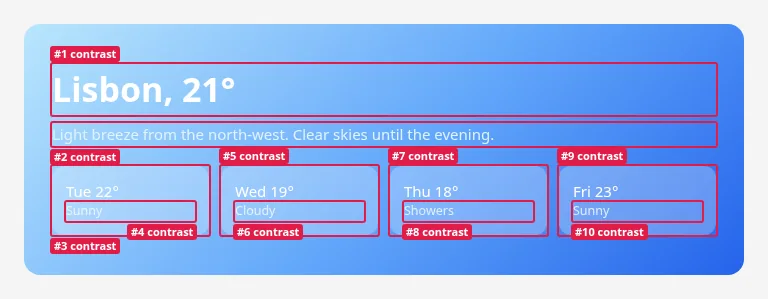
The first three of the ten findings from the run, copied from its output:
✖ contrast (10)  Text does not have enough contrast with what is actually behind it (WCAG AA: 4.5:1, or 3:1 for large text). Measured from real rendered pixels, so it works over gradients and images.
  error Low text contrast: 1.64:1, needs 3:1 — #ffffff on a non-uniform background (≈#9bd0fc).
        at main > section.hero > h1  "Lisbon, 21°"
        page /contrast-before.html · all viewports · see .renderlint/screens/contrast-before-html-eaveh@375.png #1
       fix use background #7096b5 (currently #ffffff on #9bd0fc)
  error Low text contrast: 1.59:1, needs 4.5:1 — #e0f2fe on a non-uniform background (≈#8dc5fb).
        at main > section.hero > p  "Light breeze from the north-west. Clear skies until the evening."
        page /contrast-before.html · all viewports · see .renderlint/screens/contrast-before-html-eaveh@375.png #2
       fix use background #4f6e8d (currently #e0f2fe on #8dc5fb)
  error Low text contrast: 1.66:1, needs 4.5:1 — #ffffff on a non-uniform background (≈#a0cdfc).
        at main > section.hero > div.days > div.day:nth-of-type(1)  "Tue 22° Sunny"
        page /contrast-before.html · all viewports · see .renderlint/screens/contrast-before-html-eaveh@375.png #3
       fix use background #5d7792 (currently #ffffff on #a0cdfc)
Read the first finding closely. The heading is large text, so it needs 3:1, not 4.5:1, and it still gets 1.64:1. The color in parentheses, ≈#9bd0fc, is the background renderlint measured behind that text. It is not a color in your CSS. Your stylesheet has #bae6fd, #60a5fa and #2563eb; the pixels under "Lisbon, 21°" were closest to #9bd0fc. And because the background is not uniform, the suggested fix is a background color, not a text color: you can't make white text more readable than "as white as possible".
How do you fix low contrast on a gradient or an image?
Change what is behind the text, not the text. Four options, in order of how often they are right:
| Fix | How | Trade-off |
|---|---|---|
| Darker gradient stops | Keep the hue, lower the lightness of every stop the text covers | Changes the look of the hero |
| A scrim | A semi-transparent dark layer between the image and the text | Dims the whole image |
| Move the text | Put it on the part of the image that is dark enough, or on a solid panel | Needs a layout change |
| Change the text color | Dark text on a light gradient, light text on a dark one | Only works if the whole area is on one side of the line |
A scrim in CSS is a second background layer:
.hero {
  background:
    linear-gradient(rgb(0 0 0 / 0.45), rgb(0 0 0 / 0.45)),  /* the scrim */
    url("/img/hero.jpg") center / cover;
  color: #fff;
}
Make the scrim just dark enough that the lightest part of the image under the text reaches 4.5:1. Measure that part, not the average of the photo.
Is a text-shadow a fix?
No. WCAG 2's contrast formula compares the text color with the background color. A shadow changes neither. It can make letters easier to pick out, but it does not change the ratio, and a checker that follows the formula will keep failing the page. If you add a shadow in addition to a proper scrim, that is fine. As the only fix, it is a workaround.
The fixed version
The fix for the page above changed three things. The gradient stops went to #1d4ed8, #1e40af and #1e3a8a. The day tiles went from 25% white to 12% white, so they no longer lighten the area under the text. The small text went from #f0f9ff at 85% opacity to #dbeafe.
/* before */
.hero  { background: linear-gradient(135deg, #bae6fd 0%, #60a5fa 55%, #2563eb 100%); color: #fff; }
.day   { background: rgba(255,255,255,.25); }
.day small { color: #f0f9ff; opacity: .85; }

/* after */
.hero  { background: linear-gradient(135deg, #1d4ed8 0%, #1e40af 55%, #1e3a8a 100%); color: #fff; }
.day   { background: rgba(255,255,255,.12); }
.day small { color: #dbeafe; }
White on the lightest new stop, #1d4ed8, is 6.7:1 by the formula, and on #1e3a8a it is 10.36:1. The re-run is clean:
renderlint — 1 page(s) × viewports 375px, 768px, 1280px
✔ No UI defects found.
Why does this matter more with AI-generated UI?
Contrast was the most common defect in renderlint's own experiment. In the experiment's write-up, 22 headless Claude Code sessions each built a frontend, half of them with renderlint. The 11 baseline apps had 229 errors between them, almost all of them WCAG contrast failures: muted gray captions, orange labels on white, white text on light accent colors, chart axis ticks, and text on gradients. The weather app alone had 42 errors, mostly light text on a blue gradient.
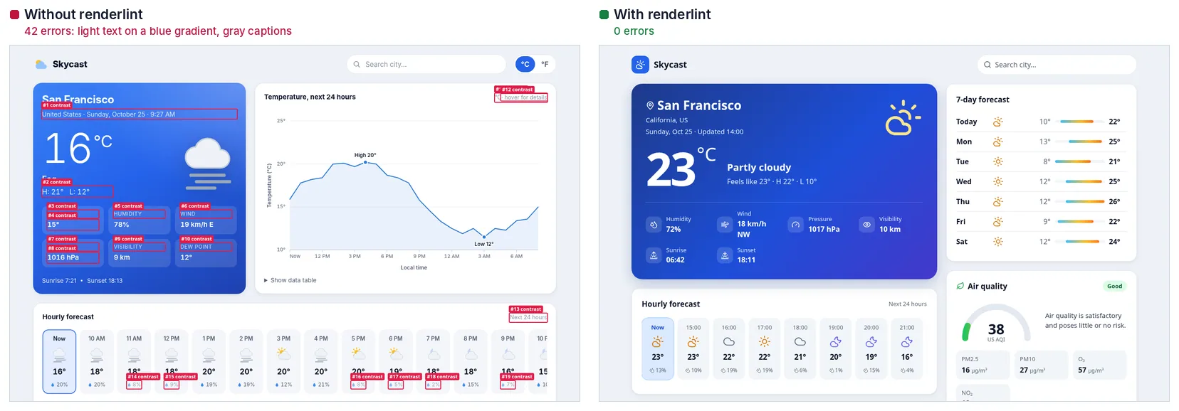
Contrast failures are hard to see on a good monitor and easy to miss in review. In those sessions, once the agent was given the numbers (2.66:1, needs 4.5:1) and a suggested color, it fixed them in one pass.
How renderlint catches it
The contrast rule is an error by default. For contrast, renderlint captures the page twice: once normally and once with all text made transparent. The second capture shows the real background behind each glyph, including gradients, images, translucent overlays and glass effects, and renderlint compares the text color with those pixels. On a flat background it does not need the screenshot: where the background provably is one flat color, contrast is measured from styles, which is faster.
What it does and doesn't do:
- It follows WCAG 2 AA math (4.5:1, or 3:1 for large text) and can be set to AAA with
contrastLevel. - It doesn't model font weight beyond the large-text rule, and it doesn't apply APCA (see the documented limitations). If your team has adopted APCA, renderlint's numbers are a WCAG 2 floor, not APCA scores.
- Dark mode is rendered too when your CSS has
prefers-color-scheme: dark. The rule's own guidance is to check dark mode separately. - When contrast is intentional (a watermark, a teaser), mark it with
data-renderlint-ignore="contrast"and adata-renderlint-reason, or--renderlint-ignore: contrastin CSS. An ignore is reviewed like aneslint-disable. npx renderlint explain contrastprints the rule's meaning and fix in the terminal. The full entry is in the rules reference, and other examples are on the examples page.
Frequently asked questions
What contrast ratio do I need for text on an image?
The same as anywhere else under WCAG 2 AA: 4.5:1 for normal text, 3:1 for large text. What changes is that the background varies, so the ratio has to hold at the lightest part of the image under the text.
Does a bigger font size lower the requirement?
Yes, but only past the large-text line: 24px and up, or 18.66px and up in bold. Under that, 4.5:1 applies, however heavy the weight.
Can I trust a contrast checker that gives one color for a gradient?
Only if the gradient is narrow enough that one color is a fair sample. For a wide gradient, a single sampled color is a guess. Check the lightest and darkest regions the text covers, or use a tool that reads the pixels.
Do I need a scrim if my image is already dark?
Not if the ratio holds under every part of the text. Photos are rarely uniform, though, so measure it rather than judge it by eye.